By providing an extended range of luminosity, HDR empowers us to express a true glow or a burst of light within a bright area as well as the subtleties of darkness within the shadows. However, with a greater WCG (Wide Color Gamut) range that is available in HDR, discrepancies might result when converting between SDR and HDR values.
A similar issue emerged when consoles and PCs went from using swatches with 256 colors to swatches with thousands of colors. It provided the ability to display more realistic imagery, but also made it easier to spot inconsistencies in poorly created artwork.
One of the ways to increase the visibility of individual UI components is to set up a specific palette that uses brighter values reserved only for your focus states. Using this technique helps accentuate certain areas within your UI, in both SDR and HDR, and it helps guide users through the menus and HUD.
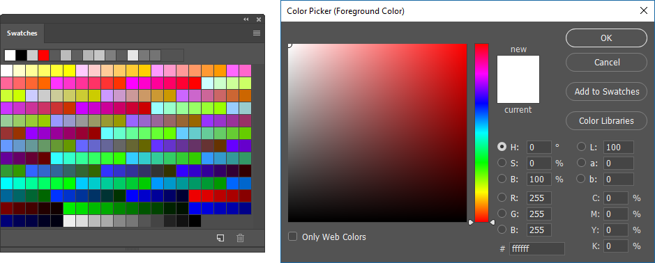
TIP: If using an 8-bit palette in your game, reserve the upper range of colors in the Color Picker for the UI focus states:
Note: Although HDR and WCG (Wide Color Gamut) are often used interchangeably, WCG is meant to describe the range of colors displayed on a television screen.
Floating point in luminosity
In HDR, designers control the RGB values and use the so-called floating point to adjust the luminosity (brightness) of color. Floating point starts at 1.0f. When it is increased above 1.0 (for example, to 2.0f), white objects will have more luminance and any paper-white objects will look light grey. If it is increased even further, the brightest object on the screen will appear white and luminosity will decrease for all other objects:
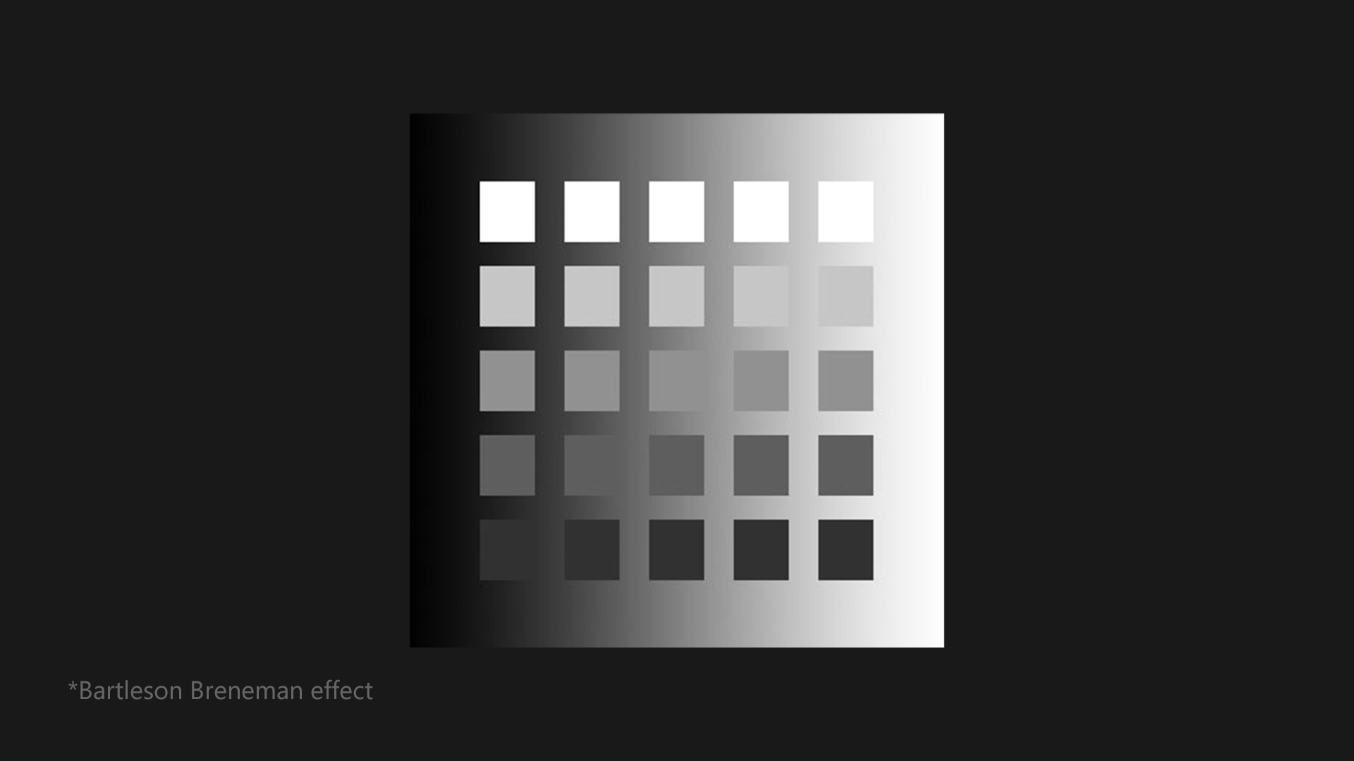
Bartleson/Breneman effect illustrates how white color looks next to brighter objects.
Tip: Identify a shade of white that does not bleed or glow and that’s perceived as a white color on an HDR screen. This is considered a paper-white color.
HDR and focus states
HDR renders menus, highlights, effects, and other UI elements with enhanced visual fidelity. Adjusting the luminosity values lets you enhance the focus state and better guide the player through the UI menus and game. Use HDR to highlight the focus states and the following elements:
- Additive Material
- Glow
- Animation
- HUD elements such as health bars, trailing reticle effect, and notifications
To maintain continuous feedback from a particular element without keeping it in constant focus state, use a combination of bright values and shimmering animation or pulsating glow.
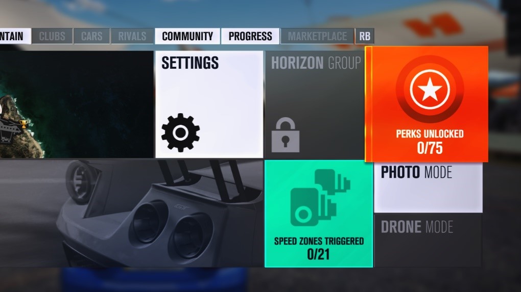 Screenshot from Forza Horizon 3
To help guide the player within your UI, use motion graphics and special effects while the player transitions from screen to screen. However, use these effects strategically and sparingly.

Colors and gradients
Gradients have always been limited by color range, due to the following:
- bit depth of the source art
- output of the signal
- compression rate
- television display
Color range might also affect how elements are animated or rendered. A wider range of colors possible with HDR lets you use a non-linear curve and to achieve fading effects of quality on par with that of motion pictures.
HDR and WCG require at least 10 bits of precision, because they represent a larger range of values. Squishing all black, white, and bright values into a 0–255 range will not work and will cause banding.
Low-end HDR TVs use an 8-bit palette, but that’s less desirable. Source art created using only black and white shouldn’t be a problem, because it’s represented on the ST.2084 curve. However, loading screens may show banding because more values are displayed in the darker color range.

Tip: Only two measures can reduce banding: using a higher bit-depth and adding dithering. To work around banding, use textures that are at least 10 bits in depth, and use graphics or effects to break up linear gradients on screen.
Transparency and Overlays
Many games use a transparent UI menu to help separate layers of information from the background and in-game world. Transparency might be perceived slightly differently in HDR than in SDR, even though the values are the same. The reason is that with a semi-transparent HUD overlay and a bright HDR object in the scene, your eyes will adapt to the brightest object and your brain will tell you that the HUD element is no longer white but is grey.
Tip: Use the brightest values of 100–200 nits for in-game graphics and use paper-white values of 200–300 nits for UI. This will make your UI elements appear brighter than the brightest area of the game.
To maintain a transparent background similar to that used in past SDR designs, consider using a blur shader to blur out the background and to reduce visual noise and legibility issues. In the example below, the designers used a blur-and-tint technique to make the graphics and text more visible, effectively negating any bright in-game world effects caused by HDR luminosity.
 Screenshot from Forza Horizon 3
HUD Placement
HDR uses luminosity and brighter colors to help graphical information stand out from the in-game world. A drawback is that in-world elements such as bright explosions or the sun might obscure other objects in the HUD and cause everything to bleed together as one bright glow. To prevent this issue, use the following techniques:
- Avoid bright areas: Do not place vital information too close to objects that are always bright in the game. Render the UI at a nit value higher than that used for the in-game world.
- Background displacement: Depending on the overall brightness of in-world objects, apply a transparent background and blur to help reduce bright areas on the screen.
 Screenshot from Forza Horizon 3
Notice how the designers used a blurred and tinted background for any overlay components, and how they kept important information at the edges of the screen, to avoid any bright in-game effects caused by the use of HDR.