Color has been extensively covered in Art & Design throughout the years, and there are mutliple sources from published books to websites that explain Color Theory, how it has been used to project emotion and meaning. Although Color Theory is a very important element in design, this article will focus on how it is used in games.
Usage in games
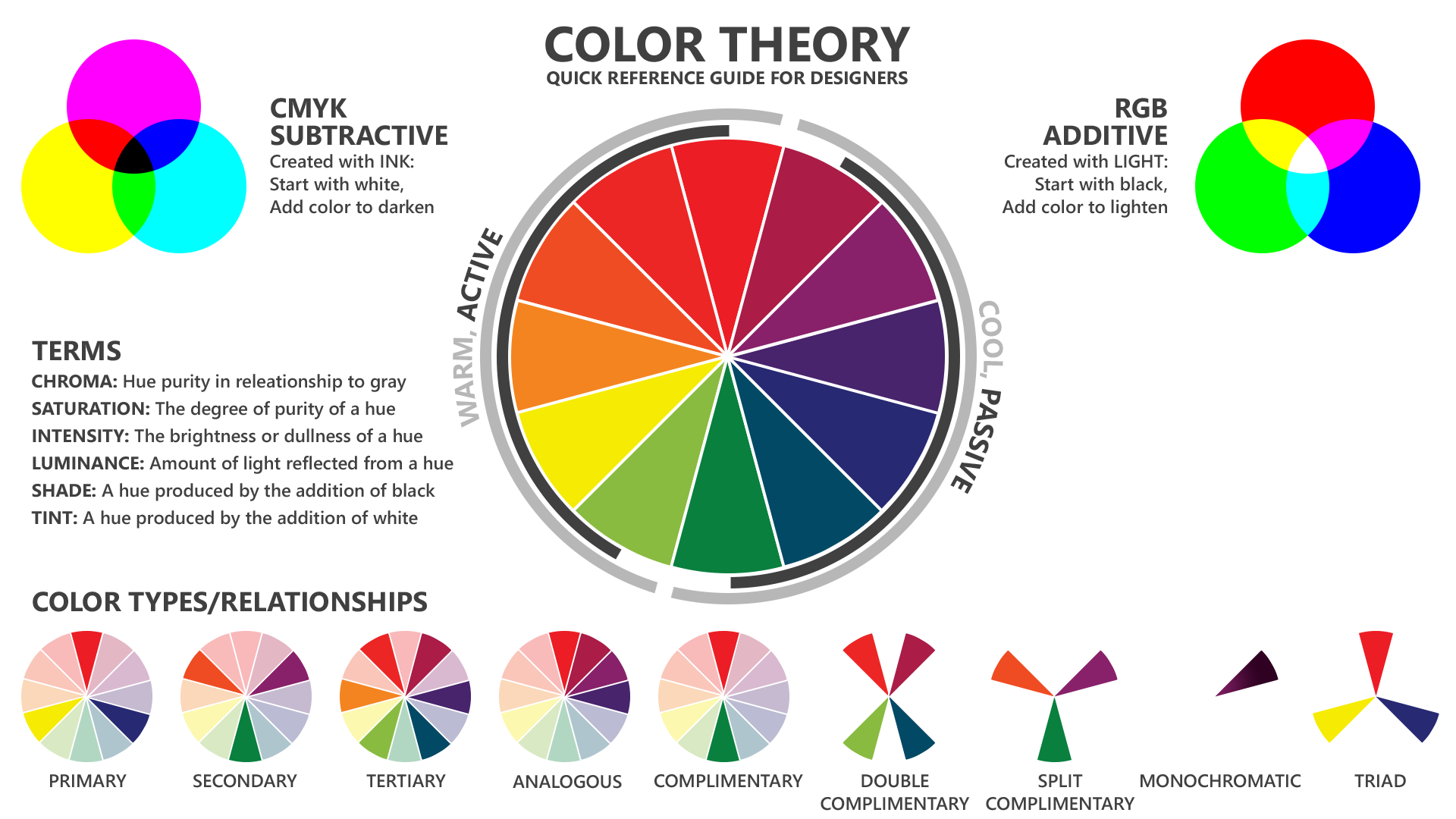
Use color to identify different states of action or interaction. Red is commonly used to indicate negative, empty, and enemy states. Green is commonly used to indicate positive, full, and friendly states.
When used sparingly and within a similar context, color can be a positive re-enforcement of information. However, too much color might confuse players and negatively impact the experience for colorblind players.
Tip: To distinguish information states within the HUD, do not rely on color only, but use distinctive shapes, patterns, or icons. Avoid using more than five colors within the HUD.
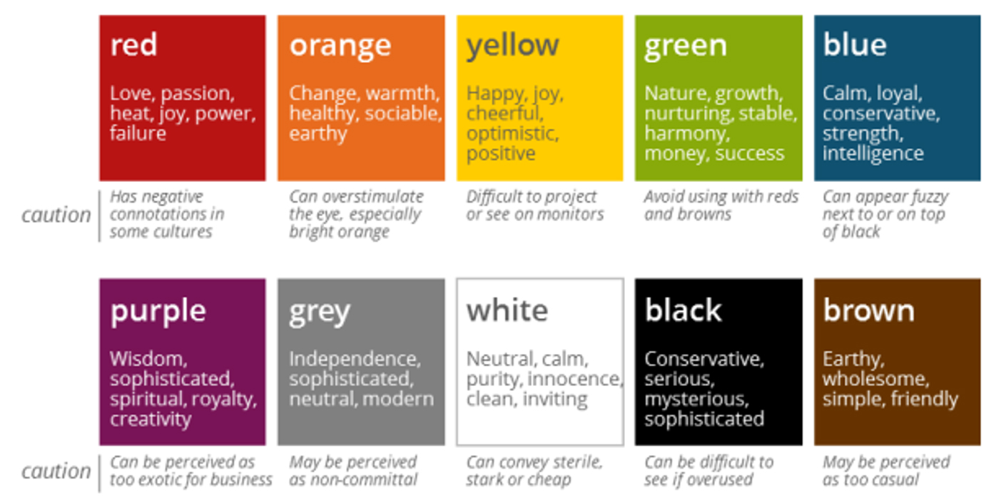
Cultural considerations
In some cultures, certain colors are considered offensive. Before setting the color palette for your game, familiarize yourself with the various meanings that colors have in different cultures:
Color palette
Your Art Director should have the palette of colors that represent your brand. Break this palette down into swatches. Work with the Art Director to determine the colors that will and will not be used in the UI. Add this information to your style guide, and refer to it often as you build the game.
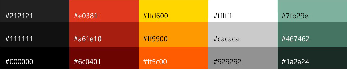
To reduce implementation effort and to ensure consistency, in your style guide, provide the hex number for each color used.
In general, try to limit your color palette to five colors, and make sure that each color has a purpose. Avoid completely saturated colors, because they tend to “bleed” on screen. Experiment with colors, and use them sparingly.
Use color to show the button states and to convey the spirit of the game.
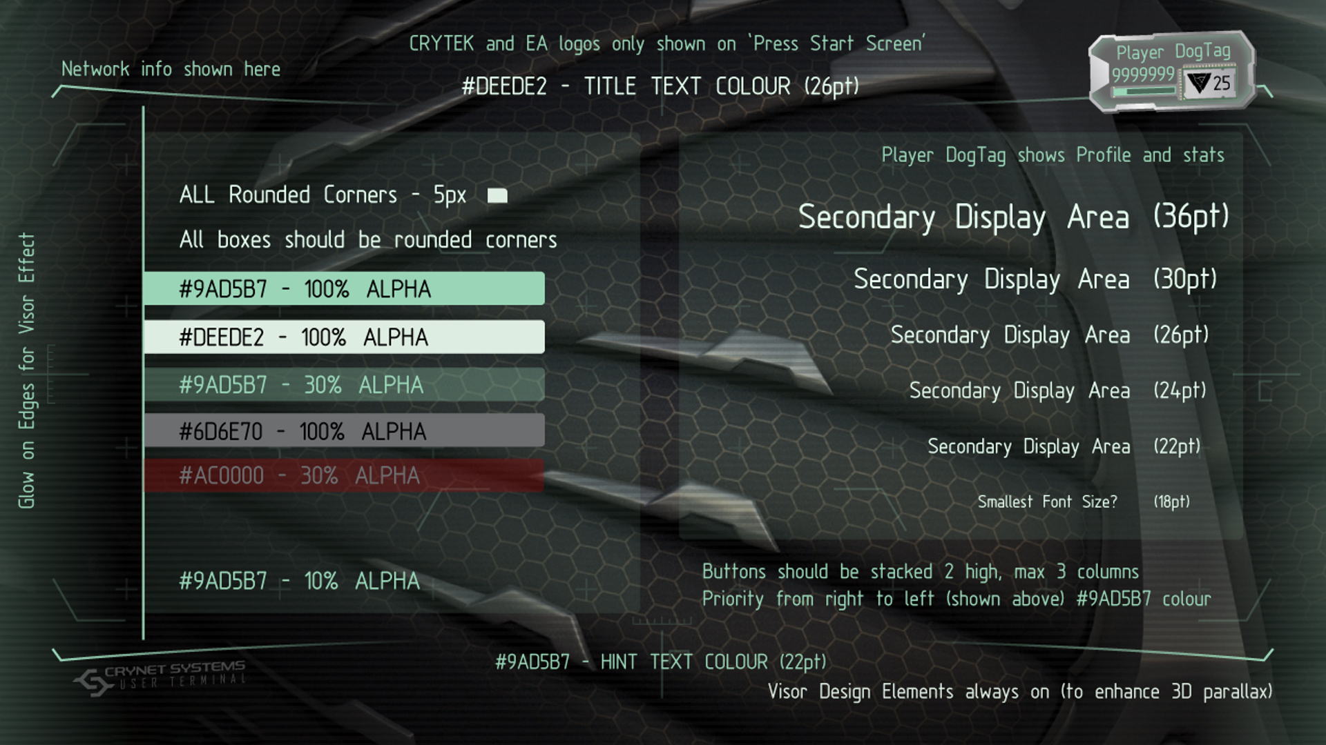
Example from Crysis 3