After establishing a color palette, create the guidelines for using each color in the UI. Providing detailed specifications on the use of color for states (Focus, Selected, Disabled, and Neutral), notifications, warnings, health, XP, and achievements will improve the overall esthetic of your design, help you educate the players on the use of the HUD and menus, and reduce the need to label every element explicitly.
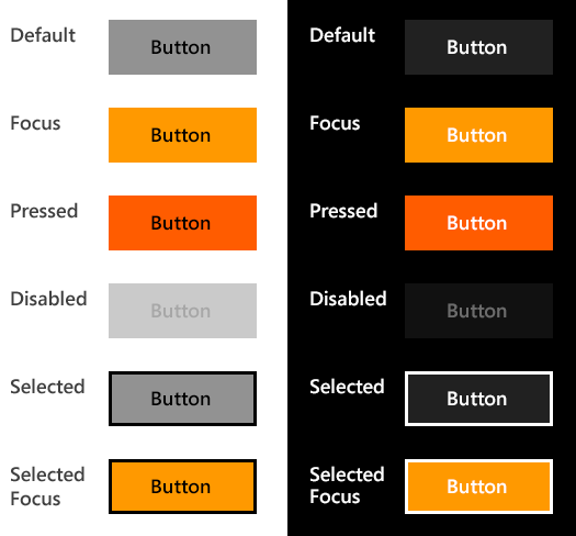
The tiles, icons, and text will continue to stand out even if a single color is used to indicate the Focus state.
In-context labelling
Using color should not be your only method for distinguishing similar elements; this is especially important for colorblind users. Back up your color palette with a set of descriptive icons. To improve legibility further, place icons strategically, and label them in context.
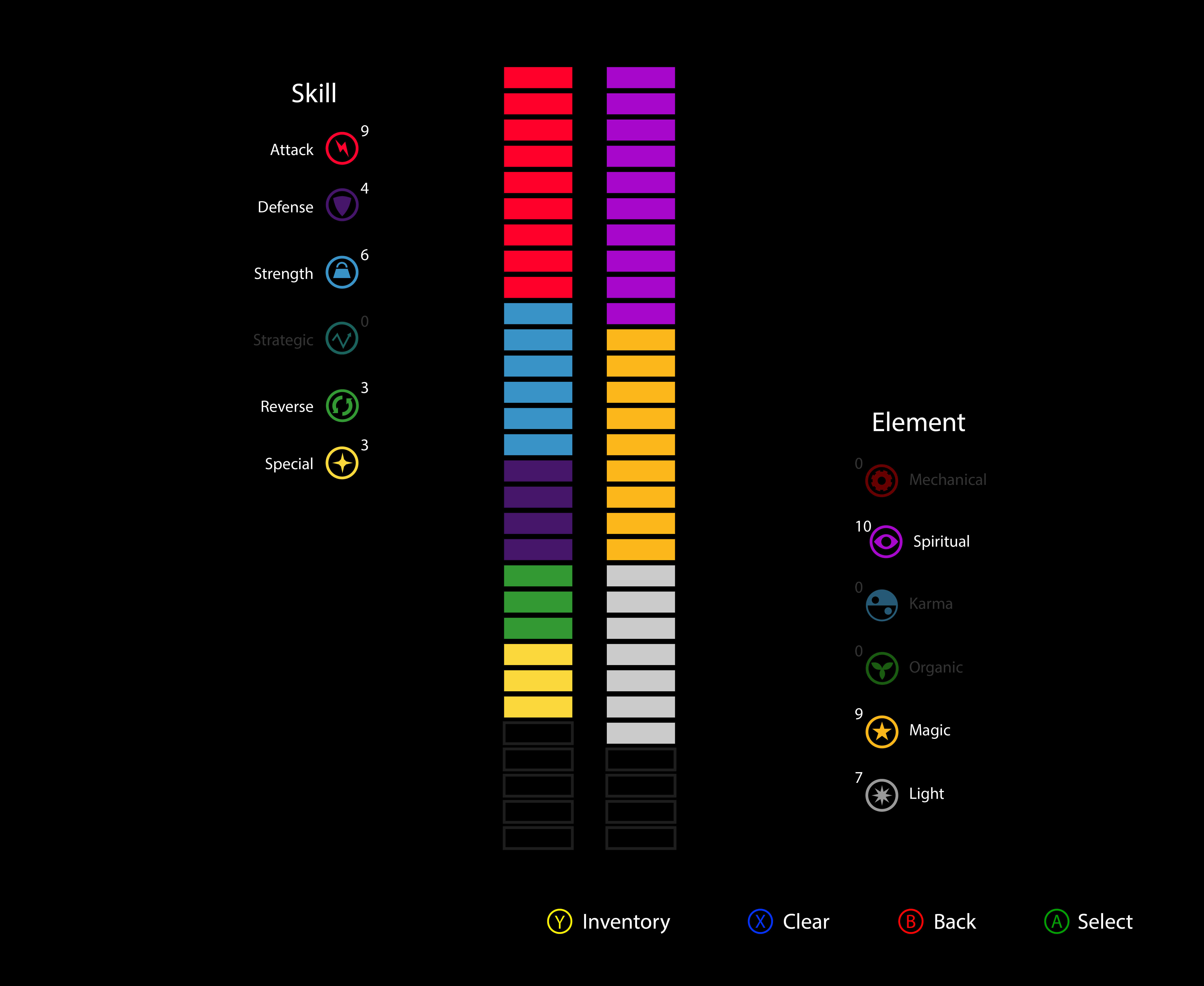
Below, Example A diagram shows two vertical lists of icons: Skill and Element. This style of presentation might confuse players about the two sets of stats, and it might compromise the players’ ability to distinguish similar colors in the legend.
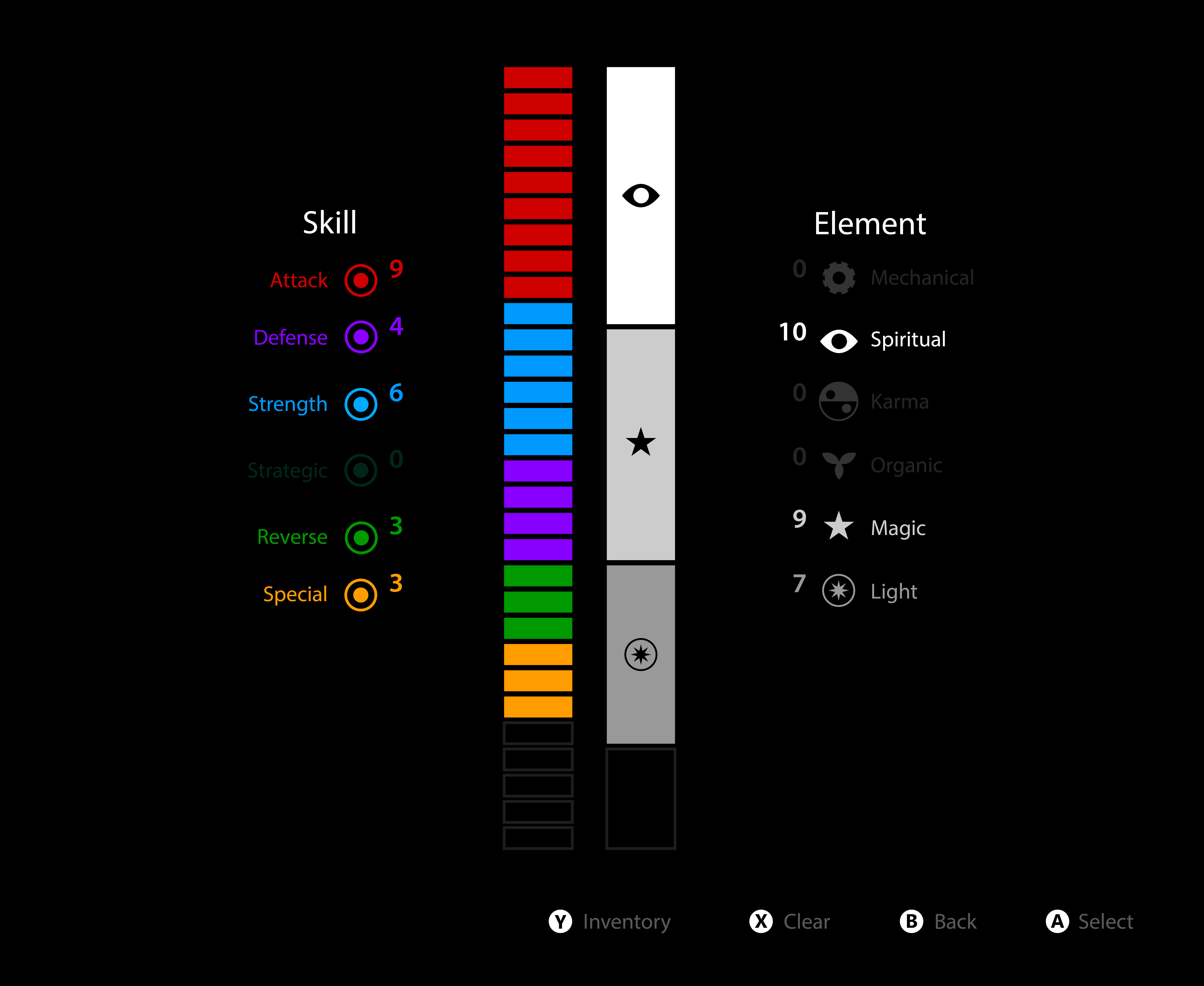
Contrast this with the diagram in Example B, where the font in the Skill list was made larger, color coding was added, and the icons were simplified. The Element list has a single color but various kinds of icons. This style of presentation works better.
Navigation
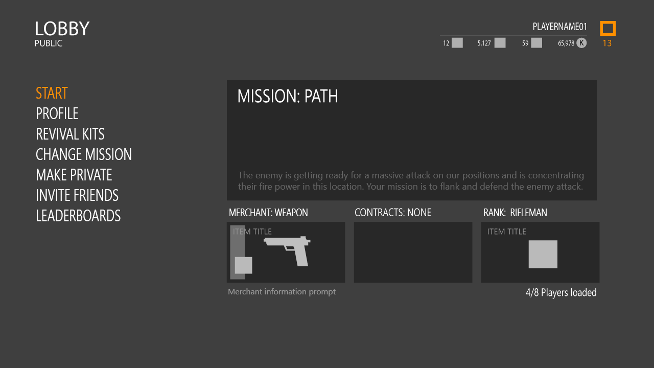
Color helps make navigation intuitive and enhances interaction. In the screenshots below, the focus color is used in the navigation list on the left and then in the submenu and grid.

Shades of color
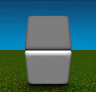
In the illustration below, the top block looks darker than the bottom block. Now close one eye and hold your thumb up to cover the middle line. Now both blocks appear to have the same shade of grey. This demonstrates that the environment has a major impact on how the user perceives different shades of color.
The HUD will be competing against the game’s environment, so use color sparingly and make the UI elements stand out by using luminance and colors that are not abundant in the environment. For example, in the screenshots below, color is used sparingly, for teams and certain events (the UI color palette is shown on the right).
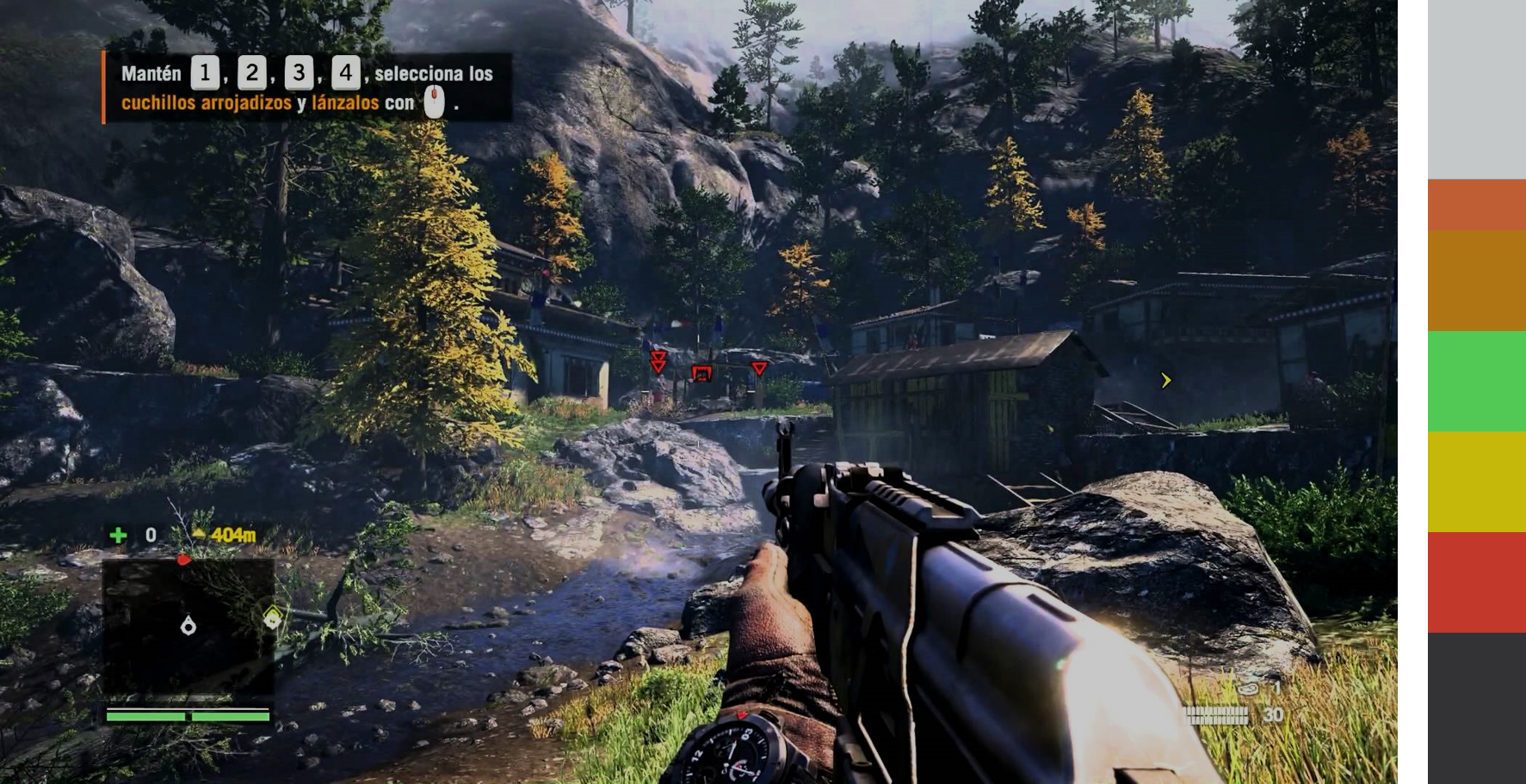
An example from Far Cry 4
Red color is used in the center, to convey information that is critically important:
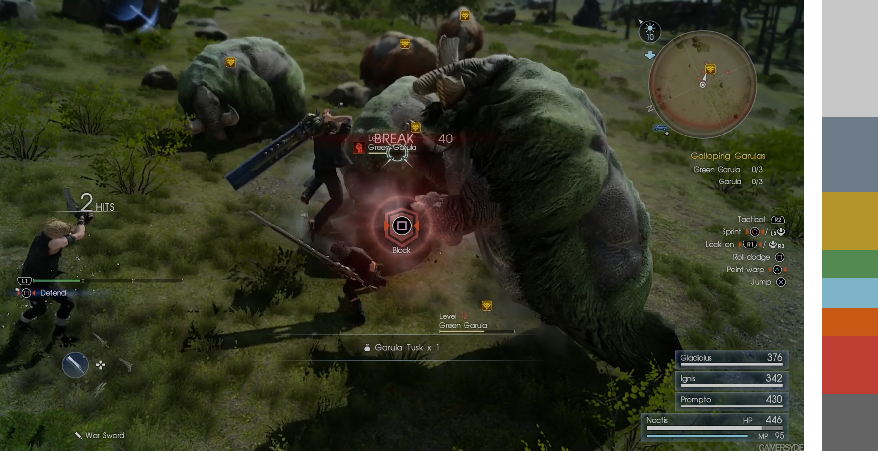
An example from Final Fantasy 15