When designing menus within a game, follow these seven principles for a consistent and accessible user experience.
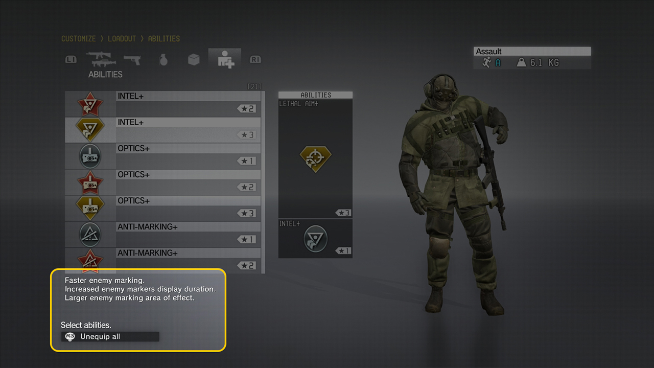
 Example from the Metal Gear Solid Customization screen
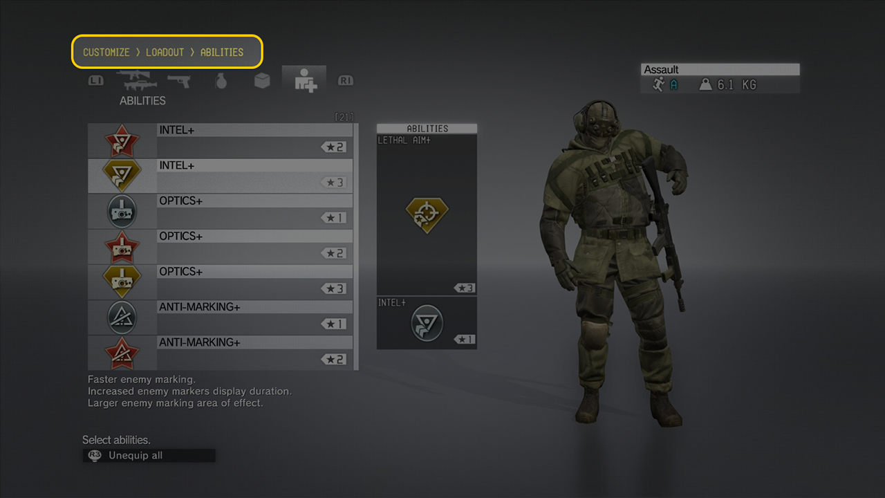
Seven unique items per screen
Having more than seven unique items on one screen will overwhelm most users. Display only the most important information, which is what the majority of viewers will explore first. To let user dive deeper into each area, implement additional navigation.
This menu consists of six items only. Adding more items would overwhelm most users.
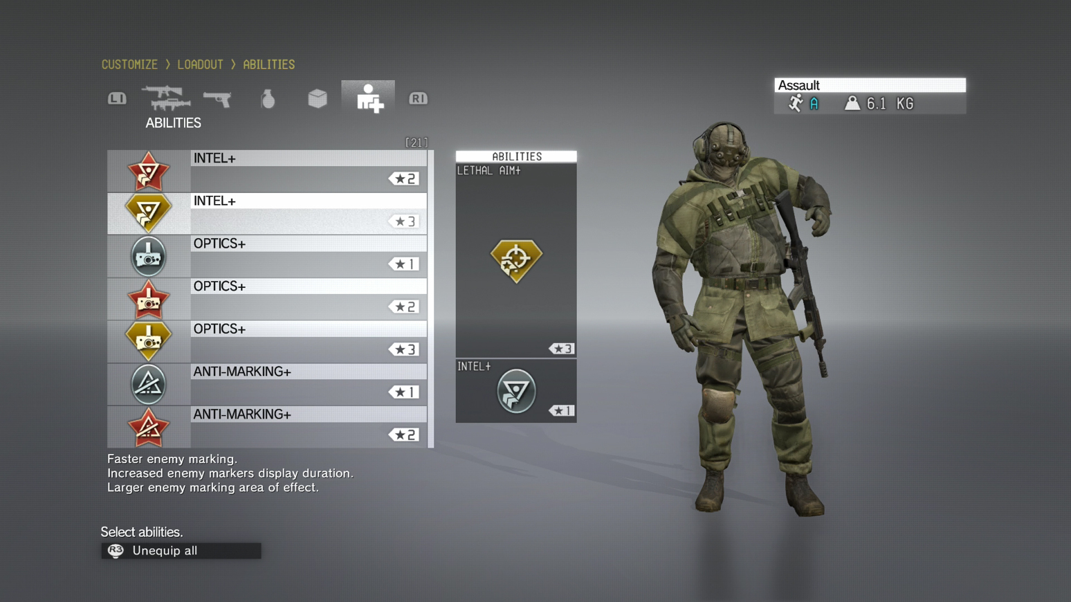
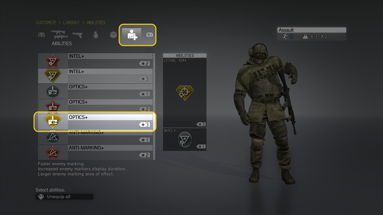
Three levels per menu
To ensure that most information can be accessed quickly, have no more than three levels per menu: Menu Topic > General Overview > Detail Overview.
The menus are three levels deep, so the user needs three clicks to get in and out of the most detailed menu.
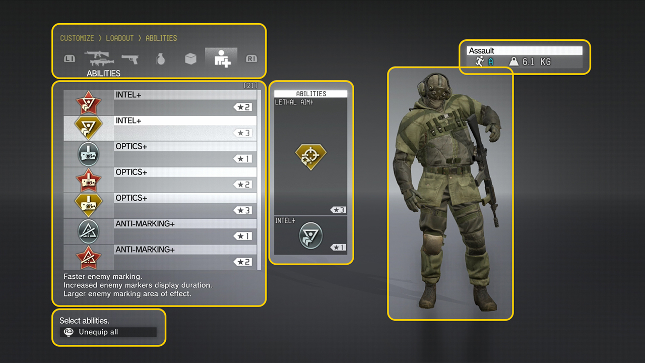
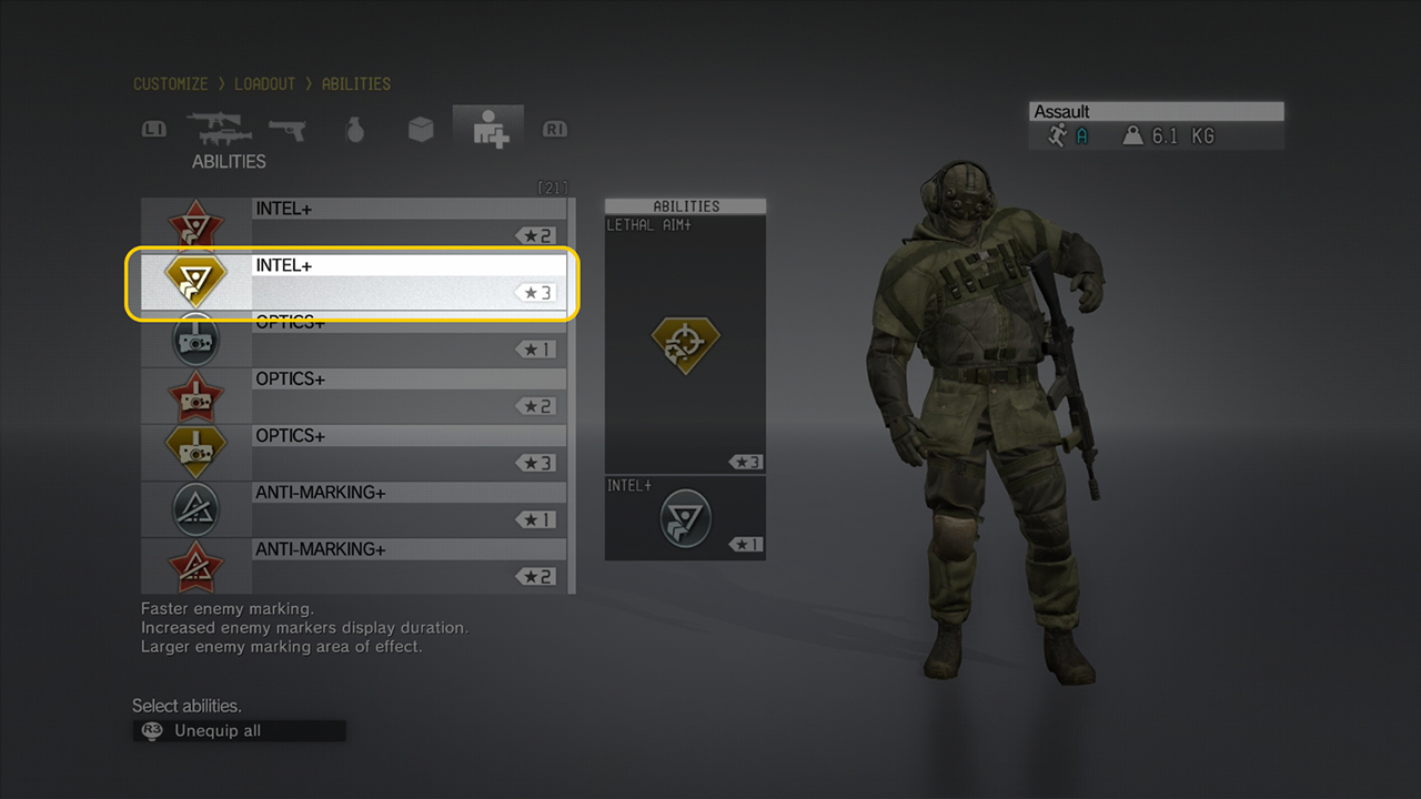
Affordances
According to the Interaction Design Foundation, affordances “are an object’s properties that show the possible actions users can take with it, thereby suggesting how they may interact with that object.” Examples of affordances are the UI components such as buttons, sliders, and check boxes. Design them to meet the players’ expectations.
Buttons must look and work as expected.
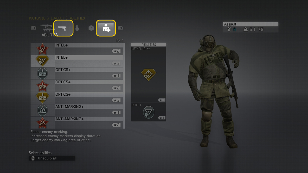
Focus area
Focus areas help communicate the current state of a selected or selectable object in the UI. They also indicate where the controller’s selection is located on the screen.
The focus area can be implemented as a pulsing selection that draws the user’s attention.
Recommendations: To guide a player around the screen, use consistent colors and effects throughout the UI. Also, use distinct focus states to communicate the difference between interactive and informational items within the menus; this is similar to how you’d convey this difference through the button hover state and a cursor swap with a mouse.
With a mouse cursor and a monitor two feet away, there is hardly any disconnect between the cursor and screen. Contrast that with using a controller and a fixed grid layout at a distance of ten feet.
State changes
The four common states of buttons are Normal, Disabled, Selected, and Focused. The fifth state, Locked, is used occasionally in stores, save slots, and skill trees. A common practice is to use a Lock icon to represent a locked item, but this does little to inform the player about what can be done to unlock the item.
To make the state changes easy to identify, vary the color and intensity and add other graphical elements.
Tip: If unlocking a locked item requires some currency or achievement, then state so clearly.
Page flow
The layout of information should follow the pattern that the player’s eyes make as they scan a page: from top left to bottom right. Arrange your components for easy comprehension, by using breadcrumb titles, columns for navigation, descriptions, and the visual and statistical information. Design the menus such that users can quickly distinguish between interactive and informational areas.
The arrows indicate the pattern of movement made by the player’s eyes as they scan the page to discern the layout and hierarchy of information.
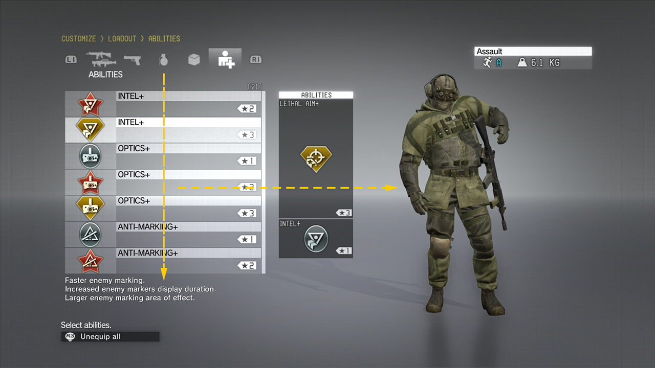
Tip: Because the eye tends to move from top to bottom, place the functional navigation components above any related information and descriptions.
Help and hints
Menu designs use button prompts (sometimes called legends) to help players with the mapping of the controller or keyboard. Along with button prompts, provide additional information that is based on the screen content or a selection.
Typically, button hints are displayed at the bottom of the menu.