Follow these two main rules when designing the layout of the HUD:
- Do not obscure core gameplay with HUD components.
- Make HUD components clear and legible from 10 feet away.
Game genres vary with respect to gameplay strategies, camera positions, and focus of action. In most genres, however, HUD components tend to be displayed as separate from the core gameplay but still close enough to be glanced at quickly. In addition, because the left side of the screen is viewed more often than the right, place the HUD’s most frequently accessed information at the top and on the left, and place secondary information at the bottom and on the right.
To determine the best placement of HUD components, divide the display area into a nine-part grid:
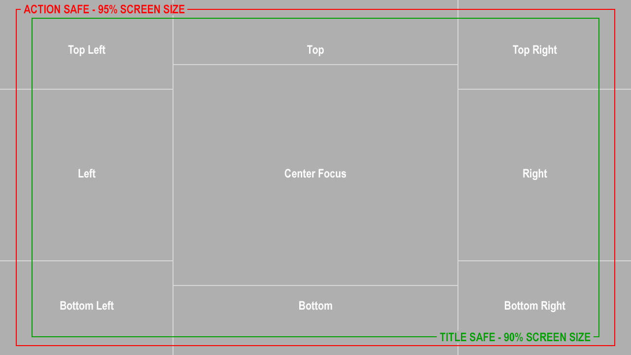
Action Safe - Place all vital actions within 95% from the edges of the screen.
Title Safe - Place all vital information, including icons and text, within 90% from the edges of the screen.
Center Focus - Use this highest-visibility area of the screen to display the gameplay, characters, vehicles, and reticle. In menus, the center area is usually reserved for maps, controller layouts, vital information, and statistics.
Top Left - In this highly visible area, display primary information, such as screen titles, subtitles, high-level menus, game callouts, Health and XP bars, and player stats.
Top Right - Display secondary information, such as the enemy’s health or XP, player 2’s health or XP, notifications, scores, player stats, and currency.
Top - In this important area, display linear compass maps, ammo counts, and timers. The eye can easily register this area’s contents while maintaining focus on the center of the screen. When designing menus, use this area to display menu titles or currency statistics.
Left - Display menu lists and navigation, as well as notifications, progression information, secondary collection, and meters.
Right - Display less important information than you would in the Left area.
Bottom Left - Display button callouts for menus, mini-maps or inventory.
Bottom Right - Display less important information than you would in the Bottom Left area.
Bottom - In this important area, display ammo and weapon information, car stats, dialogue subtitles, in-game tutorial titles and text, and button prompts in menus. Also use this area for progression bars and meters, as well as for secondary information that supports the menus.
Design for the worst-case scenario
A game can have a variety of situation-specific HUD components. To ensure that all components are legible, design for the worst-case scenario. This means that if all components were to be displayed at the same time, they would still be legible and would not overlap. To achieve this, use various techniques and programming logic.
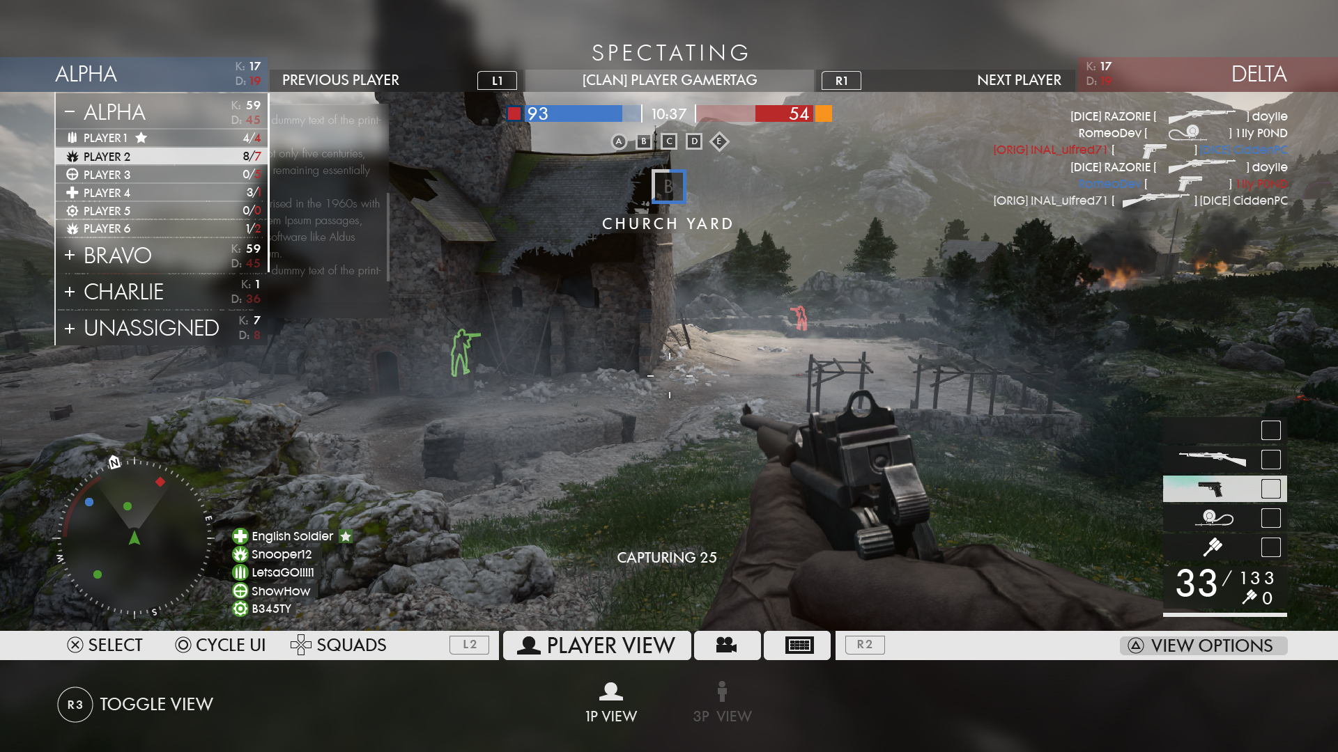
In Spectator mode of Battlefield One, there is too much information on the screen for a player to comprehend.