Static mockups are the building blocks of a UI. Establish the core components of your UI, such as buttons, drop-down lists, sliders, and progress bars. Experiment to come up with the most appropriate tone, theme, and art.
List
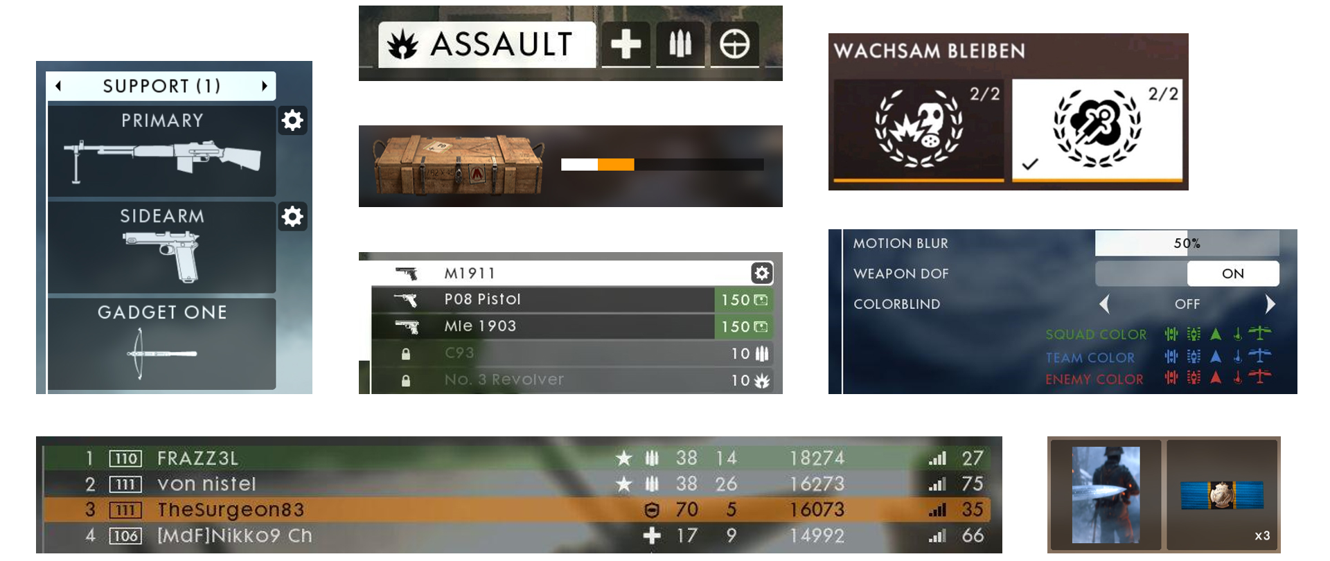
The vertical list is probably the most common component of menus. The list can contain text and/or icons. Design well-defined states for list items that are in focus, locked, or disabled. The D-Pad and Left Stick are popular options for interacting with lists.
Grid
The grid contains the same information as does the list but allows both vertical and horizontal navigation. Limit the vertical and horizontal lists to three rows and columns. This will simplify the navigation and reduce the fatigue caused by overuse of the controller.
Information Panel
Sometimes associated with a list or grid, the Information Panel gives more details about the item in focus. Information Panel can include a screenshot, video or thumbnail, stats, prices, and descriptions. Do not repeat information in the list and Information Panel. Place the Information Panel and its contents in a predictable location.
Twist-tab menus
A common way to display multiple menus on a single screen is to use a twist or tab menu. The LB/RB or LT/RT button pairs are used to navigate these menus. Typically, the Left and Right buttons sit on either side of the menu with the highlight on the focused tab.
The tabs use icons or text. If there is not enough space to display all tabs at once, then
- Use a series of dots or pips to show the total number of tabs available
- Display only the previous, next, and focus tab
Sliders
Sliders are used for making incremental adjustments to game settings. Sliders can display:
- Segmented bar (digital)
- Fill bar (analog)
- Incrementing number
- Percentage
Typically, the D-Pad and Left Stick are used to interact with sliders. An arrow-styled indicator would show the direction in which the slider can move.
Display the navigation arrows only on the slider that’s in focus. Make the slider adjustable when it’s in focus. There is no need to add a selection interaction for making adjustments; you’d only add a superfluous click.
Legends
Use legends to help the player understand or reference the controller mapping. Place the button-styled legend at the bottom of the screen or in an area that offers the best legibility.
Tip: Display the legend buttons only when they are accessible; otherwise, hide them.
Menu titles
Add a title to each menu to show the user’s location within the menu. Place menu titles in the upper-left corner of the screen and ensure that the title does not overpower the information in the menu. Some menus go several levels deep, so showing a title breadcrumb is recommended.
Brighter fonts tend to stand out, and larger fonts tend to dominate smaller fonts. Showcase the title of the screen that is in focus and minimize the title of the screen from which the user came.
Non-UI components
UI can also include non-UI elements, such as particle effects, character animations, audio cues, and haptic feedback. Enhance the user experience by integrating the following non-UI elements into your UI:
- Particle effects
- Character animation
- Audio cues (50% of the experience)
- Haptic feedback
- Game states