Marketplace
To create a great marketplace, we must encourage and guide players towards a successful transaction. The best designs of the Marketplace screen accomplish this by following these four key areas of design, while maintaining a seamless UX:
Navigation
At every step of the process, heighten the users’ expectations and encourage them to continue. Never forget that at any moment, the users might change their minds and decide to back out.
For users who are almost ready to make a purchase, make the flow simple and direct. This is when the decision to purchase hangs in the balance.
Product information
To speed up users’ progression towards making a purchase, UI designs of the past aimed to reduce the number of clicks and screens. As a result, more information was added to screens, to the point of overloading users with information and causing them to back out.
Newer designs tend to equip users with the vital information up front, on the Product Details page. Start with a clear title and product description and provide additional information on subsequent screens. Clearly display the product price, quantity, sale price, and wallet totals (if using a digital wallet as in-game currency).
For products that are on sale, special offer or discounted price, make sure to visually showcase it by using a sticker, icon or highlighted discount. To better communicate the discount of the product, show a strikethrough the old price or list the extra goods the special offer provides.
Good visuals
Catch the visitors’ eyes with beautiful visuals. Entice them to click to the next screen. Make thumbnails and icons clear and distinctive.
Celebrate the user
One of the areas that successful marketplaces handle very well is celebrating users after they complete purchases. This celebration can be a simple pop-up message or an animated sequence that showcases the item purchased. Thank the users and reiterate the purchases’ value. Leave the users with good memories. Nudge them towards making more purchases in the future.
Virtual currency vs. Hard currency
Virtual currency comes in two varieties: the soft currency earned through gameplay, and the hard currency: the real money.
Soft currency is built into the game and is used to award players for achieving goals or simply for playing the game. Hard currency is the real money that the players can use to make real purchases.
Hard currency comes in two varieties:
- Premium currency: Players use real money to purchase this currency in the Xbox Store. In a game, premium currency is connected directly to virtual currency.
- Real currency: This currency equals the actual dollar amount and is purchased in the Xbox Store.
Games that do not have virtual currency built into the meta-game design tend to use real-world (“hard”) currency.
Best practices for the Marketplace screen
To create a strong experience on the Marketplace screen, use the following elements of design:
- Clear Navigation: Don’t bury your store deep within the game’s menus. Instead, bring it into focus on the Main Menu screen.
- Button Input: Make the A/B (select/exit) button your input model. Reserve the use of the X/Y button for direct access to options such as Help, or for purchasing additional currency.
- Menu Templates: Use a template to achieve a clear and consistent rendering of a product’s image, name, description, and cost.
- Currency Shortcuts: If a game has its own currency, let the player replenish it quickly, by using a button or pop-up.
- Impulse Buy: Offer an option to purchase an item directly from the game. This will expand micro-transactions into other menus without redirecting the player to the store.
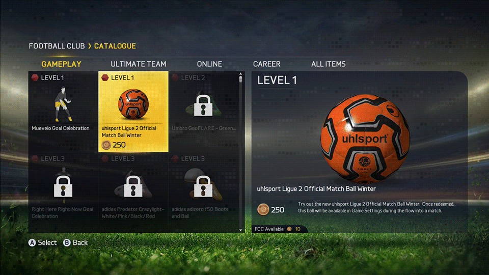
In each example above, the cost, visual representation, description, and navigation are clearly positioned within the marketplace menu. Screenshots include: Forza, Fifa, Killer Instinct