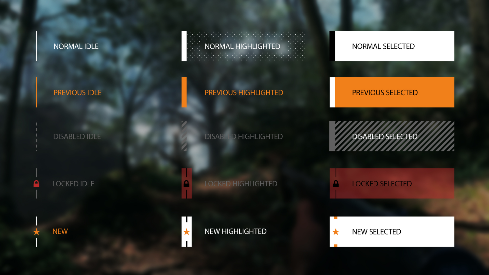
Focus states
To guide players through menus, provide a reticle or pointer. A small pointer will help players identify where to focus on the screen. When the pointer hovers on a button, change the button’s appearance to indicate that the area is available for interaction. In most controller-based games, the pointer is replaced with focus state: a technique of visually changing a button or graphic to highlight the pointer’s location. Focus state is similar to the rollover state used in games controlled with the mouse and keyboard. On touch-controlled devices, there is usually no rollover or focus state. The player’s finger acts as the cursor, and direct touch is used to interact with the screen.
The four common focus states are:
- Default state is how a button or tile will look on the screen without any interaction.
- Disabled state indicates the button or tile cannot be interacted with. Common ways to show a disabled state is to make the default state semi-transparent or tinted.
- Focus state indicates that the button or tile can be selected on the screen. This can also be referred to as a roll-over state in mouse and keyboard based games. Common ways to show a focus state is to change the button to a focus color, and/or add an effect, outline or animation.
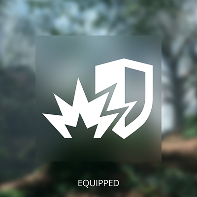
- Selected state indicates the button or tile is currently active. Selected states commonly appear in lists or grids (settings, marketplace, loadout menus) where the user can freely navigate the menu while still having a setting or object selected/active. To indicate a selected state, it is common to use a small icon such as a checkmark, outline or color change.
Less common focus states are:
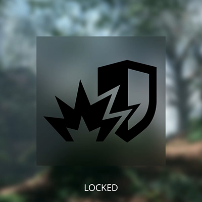
- Locked state is different from disabled, as the button or tile can still be interacted with. Common ways to show a locked state is to add a lock icon, locked text, or a required currency.
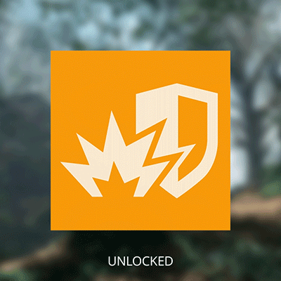
- New states are used to draw the player’s attention within a menu. Common ways to indicate a new item is to add a flashing icon such as a ! next to the button or tile.
The new and locked states are commonly used in a game’s stores, save slots, and skill trees. Although a locked icon can be used to represent a locked item, such an icon would provide little information on how the player can unlock the item.
Best Practice: To help guide a player around the screen, use focus color and effects consistently throughout the UI. Having distinct focus states will also help communicate what is interactive versus what is informational, much like the mouse hover state or cursor swap are used in PC games.
If unlocking a locked item requires some currency or achievement, then state so clearly.
Making early decisions on the kinds of button states you want to have will ensure that highlighted, highlight-free, locked, and disabled elements clearly convey interactions between the core components of your game. Such decisions will also inform your choices of the color schemes and Shape Language, which will drive the overall style and tone of the UI.
To aid readability, use clear distinctions between each state. Reserve subtle visual differences for small actions, such as rollover, highlighting, and selection of equipment. For user actions like navigation and selection of menu items, use bold, clear change states that help reinforce feedback.
Create a UI kit with all the major components that can be used to mock up a variety of FE and HUD layouts:
- Input controls: buttons, text fields, checkboxes, radio buttons, dropdown lists, list boxes, toggles, and date fields
- Navigational components: breadcrumbs, sliders, search fields, pagination, tags, and icons
- Informational components: tooltips, icons, progress bars, notifications, message boxes, and modal windows
- Containers: accordion, color picker, and swatches
You might not need all of these components but working through the edge cases early in development will let you experiment and iterate. In some cases, you might have to create custom components to best represent the unique features of a game.
Think modularly, by breaking down all of the components into their core individual elements. For example, a scrollbar might consist of a slider, a bar, and arrows. Designing these elements as individual “symbols” in content creation software like Adobe Photoshop and Illustrator will allow for quick iteration; changing one symbol will affect its every instance throughout all mockups.
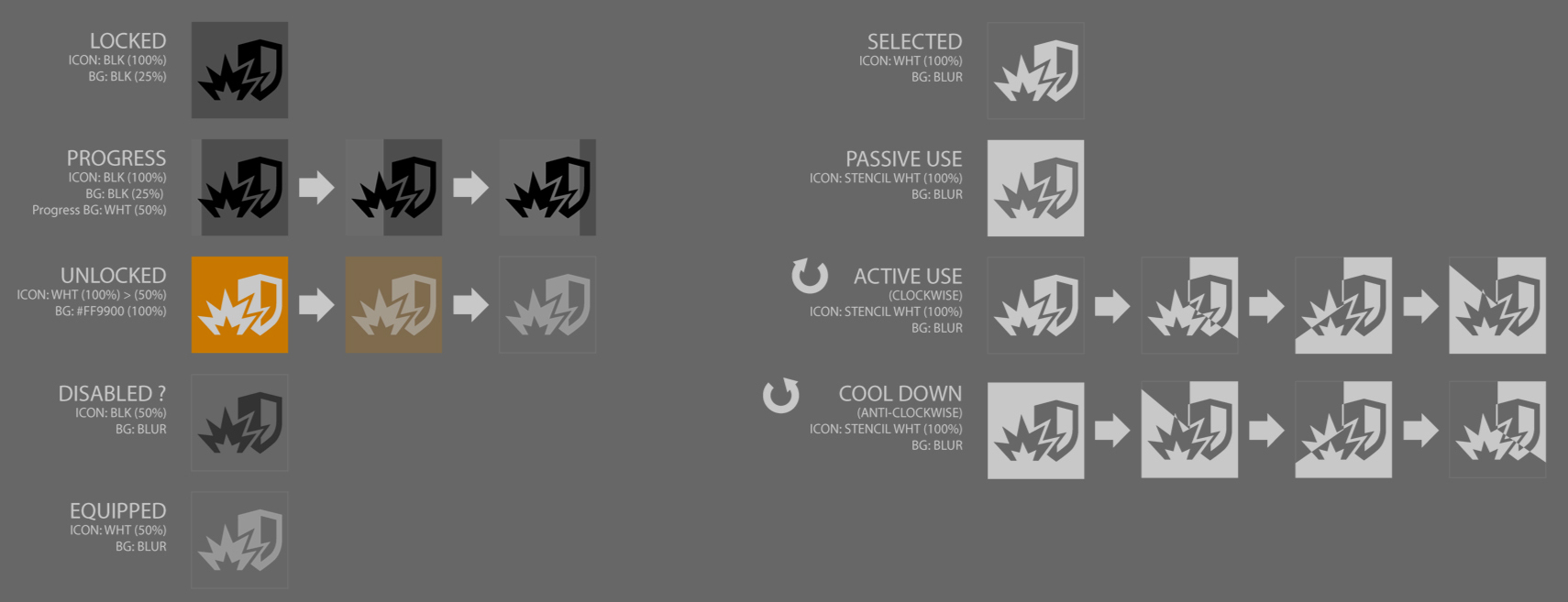
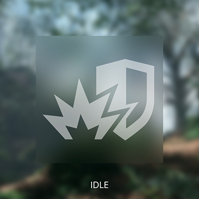
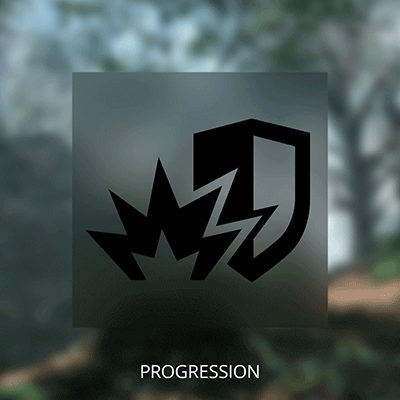
The same applies to icons. Decide how to communicate different states while maintaining consistency:
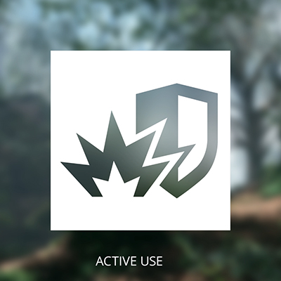
HUD gameplay features might need unique state representations, such as abilities that require active usage and cool-down states. In the example below, active usage is represented by counterclockwise radial swipe, and the cool-down state is a clockwise filling, opposite to the usage.
HUD reticle and Enemy Focus
The HUD reticle is used to anchor the player’s focus during the gameplay. The reticle is used to indicate a locked-on target, weapon or item selection, ammo count, and health levels.
The HUD reticle is one of the most heavily used UI components of a game. The more immersive you can make the focus states in the HUD reticle, the more polished your game will feel.
In third-person perspective games, distinguishing the selected weapon or ammo can be challenging, so make the in-world effects and models stand out:
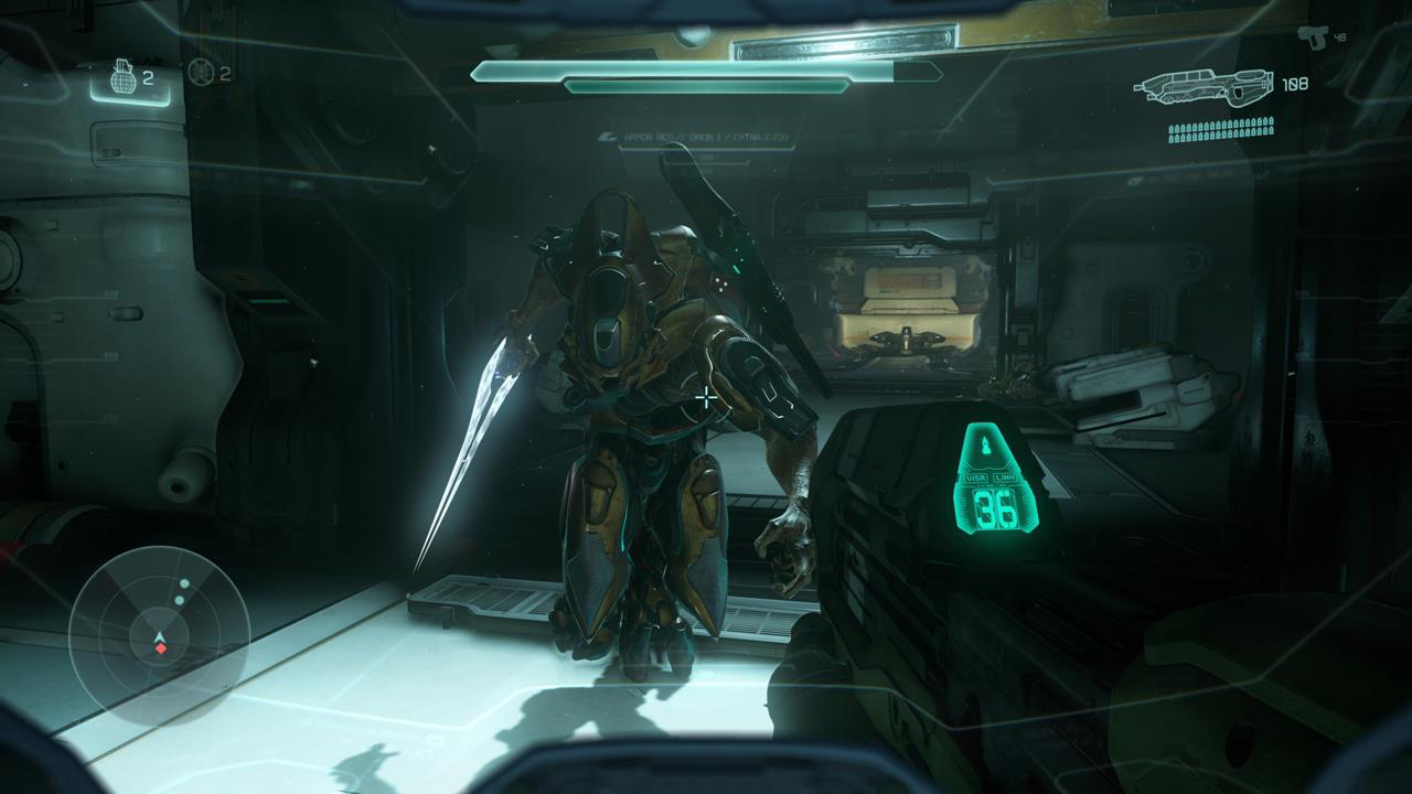
Halo 5: The reticle is fixed in the center of the screen.
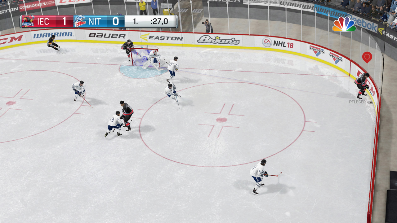
EA NHL 18: The reticle is based on the player’s location