When used effectively, typography can enhance the layout of UI elements and simplify the task of navigating and absorbing the information presented. Effective use of styles and fonts helps to visually communicate the brand of the title and to keep the user immersed in the experience offered by that title.
The Basics
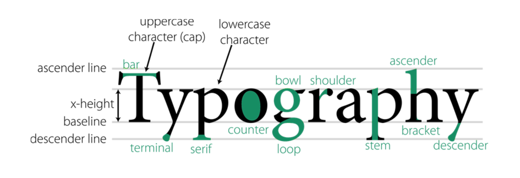
A lot goes into the design of a font, but the x-height and counter are probably the most important considerations:
- x-height: the height of the small letter x
- Counter: the area of the opening (counter-space) in letters like O, P, B
Counters
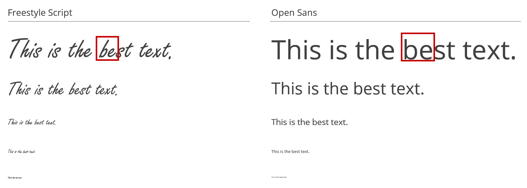
At smaller font size, some fonts are harder to read than others. Choose fonts with a larger counter, because they are easier to read from a distance.
The font can affect legibility. In the example below, check the letters b and e:
Extended characters
When designing a product that will be translated, consider that most fonts don’t not have additional character glyphs to support non-Latin characters. For this reason, ensure that your font can support the following:
- All non-Latin characters, such as Arabic, Asian, Cyrillic, and Hebrew
- Complete alphanumeric ranges
- Diacritical accents: the small glyphs added to letters (á, ــِـ, ت)
- Glyphs and special characters

Font families
In general, professional fonts have all these variations in a font family, so consider purchasing an entire font family rather than an individual font. Having a full set of fonts in hand will come useful when you polish your UI design.
A font might have many different weights and variations: condensed and extended, bold, black, light and italic.

Weight and Size
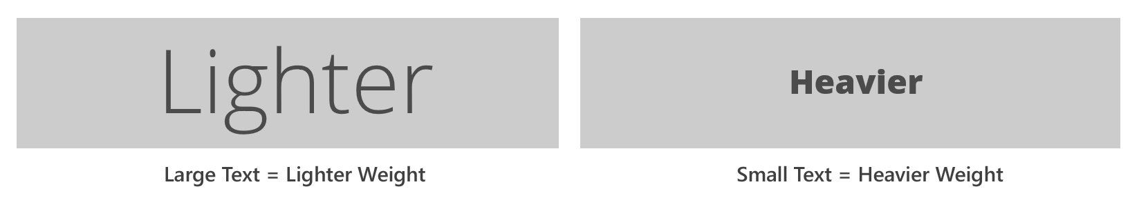
Lowercase letters with varying ascenders and descenders help the eye process word formations. For body text, use regular and medium weights for smaller font sizes; avoid using light and bold weights. For larger font sizes, use lighter font styles, for a cleaner look and feel.
UPPER CASE LETTERS OFFER LITTLE VISUAL VARIETY AND ARE HARDER TO READ.
Limit the use of capital letters to headlines and avoid using them in body text.
The following minimum font sizes are recommended for the 10-foot UI:
- Legal 15pt: This font is used for disclaimers and other legal text displayed on the title screen or in dedicated screens before the game starts. Legal 15pt is the smallest font that remains legible at all screen resolutions.
- Caption 18pt: Using any smaller font in menus and HUDs would render text illegible from 6 feet away. In the HUD, Caption 18pt is often used for players’ names, point collections, and health pickups. In menus, Caption 18pt is used for button legends, minor text descriptions, and icon and graphic labels.
- Body 24pt: This font can be used comfortably for ALL in-game messages, quests, callouts, notifications, and subtitles. Also use it for longer descriptions in menus.
- Title 30pt: When you need to create a hierarchy of information within a menu, the size of font you use can help categorize the elements on the page. When body text is Body 24pt, Title 30pt works well for menu titles.
- Header 48pt: Use this font for major categories and menu titles displayed in the upper-left corner of the screen.
- Presentation 60pt: Use this font to present major events, location titles, upgrade notices, and level-up callouts. 60pt is the minimum size that still creates an impact; however, if your game requires even bolder graphics, go bigger!
Font variations
Try to use “at most” two fonts throughout your product. Mixing fonts can make the information seem fragmented and unfocused. In addition, with an average cost of $5000–$20,000 per font, using multiple fonts can get expensive.
Try using a single font with several styles and sizes. If a second font is needed, limit its use to headings and titles. Finally, consider creating and copyrighting your own font that would suit your need and save you money.
The following fonts are used by most major publishers and support extended characters and font weights:

Alignment of text
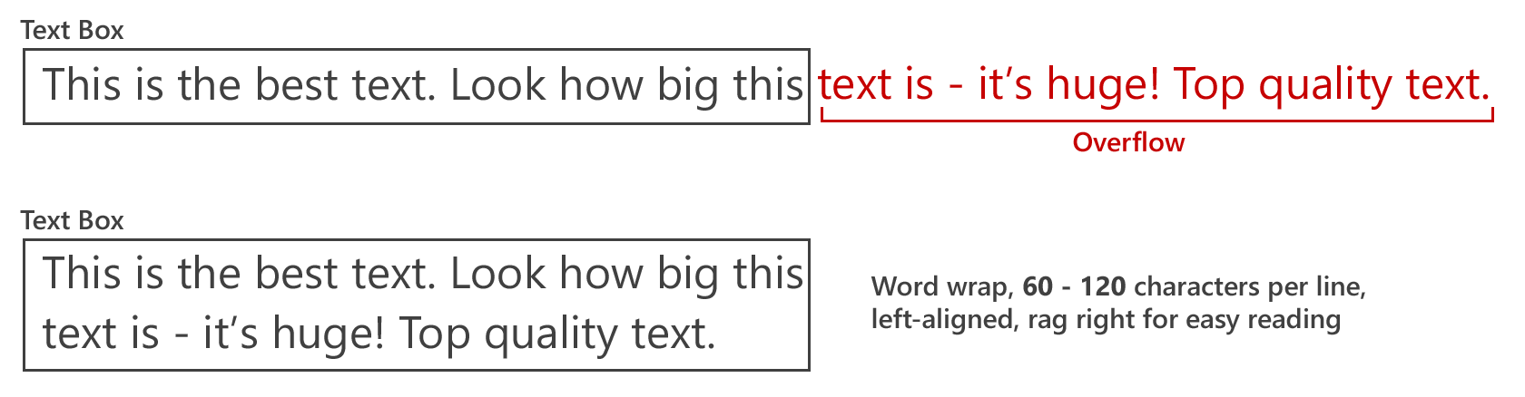
Typically, English text is aligned left. This flush-left, ragged-right formatting provides consistent anchoring and a uniform layout of content - unlike the centered, flush-right, justified formatting, which does not produce the same results and is, therefore, not recommended.
In addition to aligning text appropriately, use word wrapping to ensure that text does not overflow the margin of 60–120 characters per line.