Designing for 10-foot UI
The process of designing a console-controlled game or application is referred to as designing for 10-foot UI (although the median distance is 6 feet rather than 10). Contrast this with designing for a cell phone, tablet, PC, or laptop, where distances and screen sizes vary little.
The ratio of the screen size to distance is called the viewable screen size, and it describes the amount of space the screen takes up in the user’s field of view. The input device’s accuracy and limitations also affect the user’s experience with the game. Viewable screen size and input device are the functional limitations a designer must contend with while trying to design an enjoyable playing experience.
Maintain legibility and readability
When designing a console game, assume that a user is 6–10 feet away from a monitor whose average size is 40–42 inches. Guidelines for legibility and other specifications are based on these averages.
Tip: When designing your menus and HUD, scale your screens down to 33% of their display size on a PC monitor; if the text is difficult to read on the reduced screen, it will be difficult to read from 6–10 feet away. Use this technique to quickly estimate how your design would look on a TV screen.
Design for timelessness, not for a trend
Your choice of the font will have a major impact on the look and feel of the entire game. Choose a font that best represents your brand and is most suitable to your game. Don’t use a particular font just because it is popular at the moment.
As a case in point, Crytek, the maker of Crysis, experimented with a new font. The result was a UI that just didn’t feel like Crysis anymore:
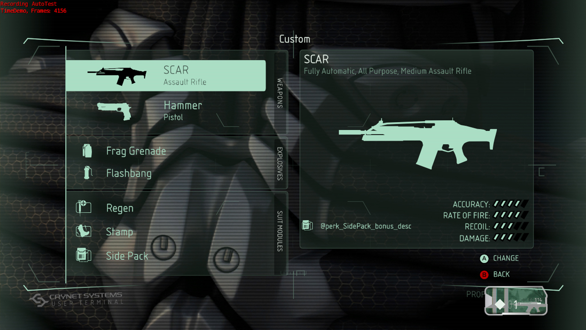
Crysis with a new font style
Subsequently, the team went back to Agency FP, the original font used for Crysis:
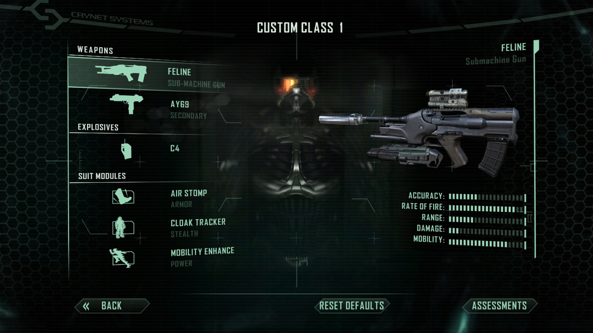
Crysis with the original Agency FP font
Optimize color and contrast
Typography should stand out from the background color, but too much contrast might be hard to read on screens. A good contrast ratio is 4.5:1, and a ratio of 7:1 provides optimal legibility. To determine the optimal contrast ratio, use the tools readily available online, such as the Contrast Checker, https://contrastchecker.com/.
To differentiate body text from subhead text, use color tinting or a heavier type-weight:
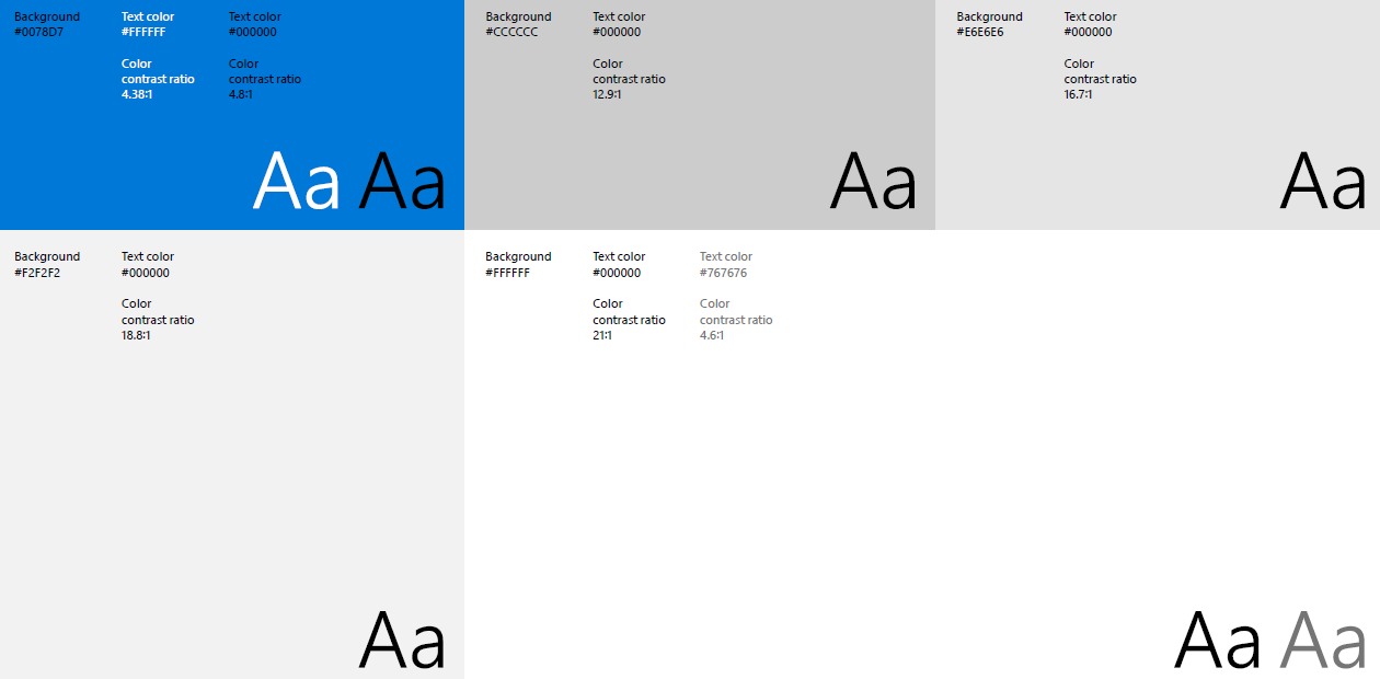
Light Theme
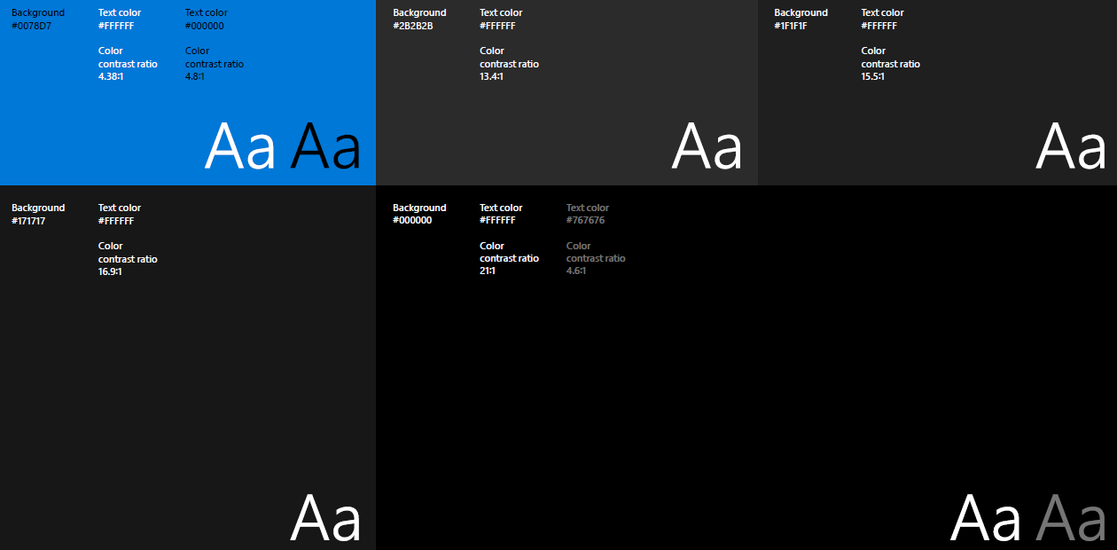
Dark Theme
Maintain the style and tone of the brand
Design a game that looks and feels like part of your brand. If you have your own brand font and it works well with your game, then consider using that font for the menu titles, text callouts, and other UI components.
Create a guide of the fonts and styles you’ll be using and describe the rationale for using each font. Keep this guide a living, breathing document that is replete with examples (wireframes) and that clearly communicates your ideas to your Art Designers, Directors, and Producers. Here are a few examples:
- Primary font: Gill Sans®
This classic font is legible and works well for displaying any informational and HUD text.
According to linotype.com, “Gill Sans is a humanist sans serif with some geometric touches in its structures. Legible and modern, the lighter weights work for text, and the bolder weights make for compelling display typography.”

- Secondary font: Othello™ According to linotype.com, “Othello’s dense graphic demeanor delivers a straightforward, no-nonsense message. Small caps and alternate letter variants create new possibilities for headlines and short text blocks in advertisements, signage, and packaging. This font also has the look of woodcuts or hand-drawn lettering and would make for an interesting title font.”

Here’s an example of font usage:
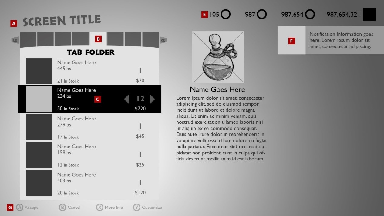
The following font styles and sizes are considered optimal for console games:
- 100 pt Big header: Othello™ Medium
Congratulatory messages displayed when the player advances to the next level Timers - 60pt Headers: Othello™ Medium
Titles of menus: A - 36pt Sub-headers: Othello™ Medium
Titles of sub-menus List categories: B - 24pt and 30pt Body text: Gill Sans®
Body text, descriptions, subtitles, currency, item titles, and in-game callouts:
C D E F G