Alignment and anchoring
As a rule, always left-align elements for markets in the West, where most users read from left to right. For markets in Asia and Middle East, right-alignment might be required for localization purposes. Keeping these rules in mind can help create layouts amenable to localization.
In the diagram below, the example on the left is aligned inconsistently and looks janky; navigating around such a layout can be challenging. The example on the right is left-aligned uniformly and spaced apart consistently.

Ensure consistent spacing between elements, and anchor them as much as possible. Unless Art Direction specifies otherwise, arrange the elements in an orderly fashion, to lighten the cognitive load.
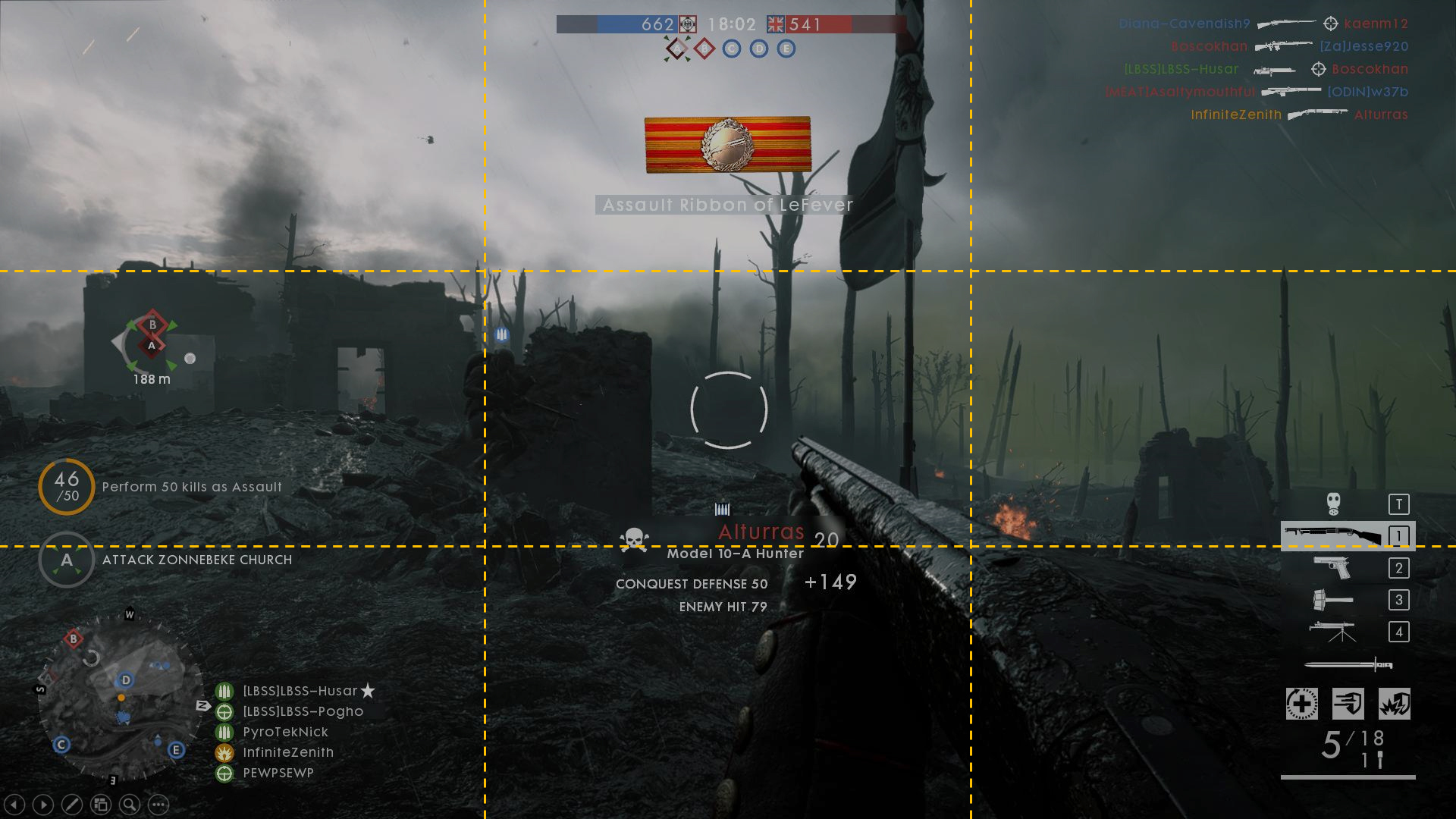
Segment the screen into nine rectangles, each with an anchor point:
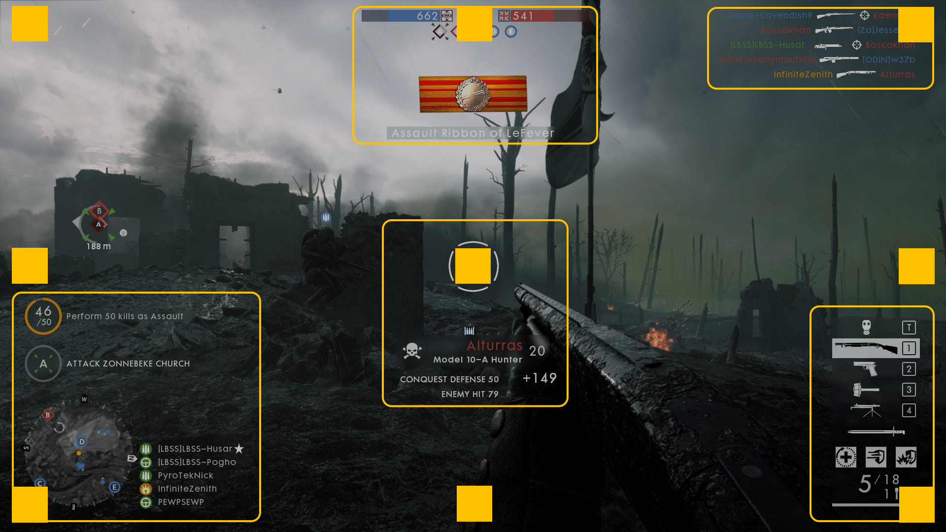
A screenshot from Battlefield One.
The anchor points will help you lay out the UI and ensure clear and logical positioning of elements:
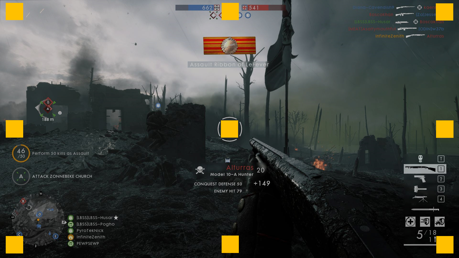
The anchor points indicate the location of the components on the screen. This ensures that when you reformat your screen for the 4:3 or 21:9 ratio, the information moves but is still rendered consistently.
Notice that components in the middle of the screen are center aligned, the components on the right are right aligned, and components on the left are left aligned: